

Some of you might remember a little newsletter that went by the name of “Dead Ball Daily”. And some of you might not even remember that newsletter, but may remember a recurring column that ran in that newsletter that went by the name of “Trash Compactor”.
Well it’s a great day for all of you folks, because there is seemingly an abundance of trash in this world. And I am here to insult it as such.
THE LEAKS
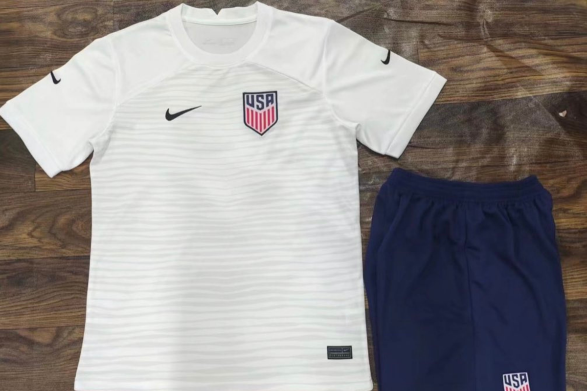
Take a gander at these leaked USMNT World Cup jerseys that circled the Twittersphere a couple of weeks ago:
🚨 seeing some final drafts of the #USMNT 2022 home and away World Cup jerseys… pic.twitter.com/toXAupsj1b
— USMNT UK (@USMNT_UK) May 5, 2022
Now, it’s important to note that Footy Headlines, the usually-reliable source of so many jersey leaks in the soccer world, are confident that these are knock-off kits, and will not be what the actual USMNT kits look like. The real USMNT kits will look like… a slightly adjusted version of these knock-offs, by their best estimations.
This design (and I use the word “design” charitably here) looks like it was created by the graphics department of a toothpaste company, and even then they would scrap it for not having enough zing, or whatever it is toothpaste executives say to each other when they try to describe their brand aesthetic. I imagine it’s several executive 60-somethings standing around and making jokes using the word “fresh” until the base salary employees in hearing distance begin stapling their own ears shut.
In terms of crimes against being interesting, these kits are up there with the club t-shirts that Puma gave Italy for last year’s European championship. They are solid color shirts that appear to be most useful in lulling the opposition into a stupor. You know how a person’s eyes get glassed over when they can’t find anything good on TV to watch on a Saturday, and so they just end up sinking into the yawning maw of their couch while consuming an unhealthy amount of Chopped and Guy’s Grocery Games? It’s like that, and then Jesus Ferreira scores on you.
If Nike and the U.S. do end up going in this direction for the World Cup kits, it will be especially disappointing considering just how good the kits for the country have been lately. The primary jerseys aren’t the most interesting thing in the world, sure, but they take the “clean” aesthetic and at least make it look good, with the red striping down the sides of the jersey giving the strip a nice-looking embellishment. And they’re offset by a kit that I think is one of the best the US has had in years, the so-called “Stadium” set.
I understand that the all-over dazzle camo pattern isn’t for everyone, but this kit is a great example of designers and teams taking a chance and coming out with a fantastic result. It’s distinctive, it’s unique, and it’s unmistakable who is playing in these kits.
Now, the U.S. teams get to play in…white. White and blue, for the foreseeable future.
BREAKING IT DOWN
For the sake of fairness, let’s break down these “mock-ups” of “potential World Cup kits.” There seems to be some innovation at play here, as Footy Headlines reports that the Nike swoosh will actually go on the sleeves, and not on the chest. Very brave, Nike. A daring choice. Next, this tour de Americana invites you to glance downwards to the torso. On the primary jersey, the white on the top gives way to even more white, in an homage to every head coach of the senior USMNT in history (and senior USWNT head coaches, as it were!). The secondary, meanwhile, is colored the type of blue that you see on bottles of antifreeze.
Both shirts have an identical stripe-y pattern thing going on, but it’s uneven in such a way that recalls a restaurant somewhere in the vicinity of Animal Kingdom at Disney World. But a restaurant that is not affiliated with Disney in any way. Just some burger shack that a Floridian set up to try to profit off of the close proximity, and maybe even fool some people into thinking it was part of Animal Kingdom’s safari experience. There’s a vegetarian burger option on the menu called “King of the Fungal.”
That’s about it. The secondary kits get identically colored shorts, while the white kits, mercifully, look to be getting navy blue shorts.
Is the thing where we only use red once every four or five years a communism thing? Is someone at Soccer House scared they’re going to get called into a McCarthy trial? Because for whatever reason, the most noticeable color on the U.S. flag just ceases to exist in the minds of whoever is designing U.S. kits, all the time.
I don’t know what we’re doing here. If the goal is to make as little splash as possible in the World Cup after being away for eight years, we might just be accomplishing that with these kit rumors. They’re just so aggressively boring, even I almost have a difficult time believing anyone involved with Nike and USSF would greenlight these things.
For the love of Clint Dempsey’s track jacket that he wore in the “Don’t Tread” music video, can we at least get one jersey in the World Cup rotation that feels like a World Cup kit, and not like the uniform of a Vitamin Shoppe employee who’s trying to match their daily looks with their favorite brands of creatine? I don’t think that’s too much to ask.
Comments